Creating a Vintage Look with Trusses
Creating a Vintage Look with Trusses
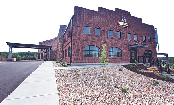
It’s not often that a component manufacturer (CM) is asked to do a project that publicly displays the components they design and manufacture. If done right, these opportunities have the potential to positively represent the industry to the entire community.
One such project fell into the lap of Atlas Components, Inc. of Cherry Valley, Illinois. Mike Karceski, the company’s president, says they had recently done some work for general contractor Friede & Associates on a large lake house in central Wisconsin. Pleased with Atlas’s work, the GC contacted them when they were contracted to construct a large, complex building for Vintage Brewing Company in Sauk City, Wisconsin. “They sent this exceedingly complicated plan,” Mike recalls. Comparing the project to previous work he had done, Mike says, “It wasn’t your modified big custom home, it was like four big custom homes.”
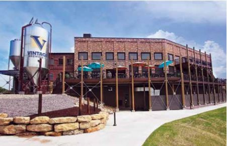 The project was a design-build project that required successfully joining numerous and diverse building elements. According to Friede & Associates, the finished structure would include up to 24-foot thick concrete foundation walls, a pre-cast floor system, structural steel framing for the upper two levels, exposed wood trusses, panelized wall framing, masonry elevator shafts and stairwells, EIFS (Exterior Insulation Finishing System), and a metal exterior skin. In addition, there would be a large glass viewing area through which guests could watch the brewing operation, housed in a large vault area in the basement with walls 16-feet high.
Scott Truehl, Friede & Associates’ executive vice president and partner, says, “When we started talking about marrying all of those elements, it was important for us to be able to work with partners that we’ve worked with in the past that could help us understand what we were going to be looking for as well as what the finish was going to look like so that we could pass that information on to our suppliers.” Scott adds that “working with someone like Mike who we’ve worked with in the past” made it “easier to explain and talk about the importance of” the finished product.
Part of the challenge was that Vintage wanted a classic industrial look, using exposed trusses to help achieve it. Instead of hiding behind sheathing, Atlas’s trusses would be showpieces integral to the overall look and feel that Vintage wanted to create. For such a project that would require both intricate structural design and aesthetic concerns, Friede & Associates felt more confident offering the project to a CM whose work they knew and with whom they felt comfortable communicating.
When offered the project, Atlas knew the bid would have to cover the extra care and resources necessary to make trusses worthy of display. Karl Ropp, an Atlas truss designer involved with the project, says, “Knowing that we would perhaps want to cull at least some of the lumber for visual appearance, or at least be cognizant of how it looked, that takes extra time and a little more care than we would normally have to do.” In addition to potentially more lumber culling, the design also included fire treated lumber (FRT) for the portions of the trusses that would be embedded in the wall. In addition, it was eventually decided that the trusses would be connected with a type of fastener not typically used on such a project: WS3, WS45 and WS6 MiTek screws. These extra material costs would add up. In addition to materials, extra labor costs would need to be accounted for as well, given the care that would need to be taken during production.
Atlas bid to design and manufacture the roof and floor trusses, leaving the walls to another CM. Once their bid was accepted, they assigned the project’s oversight to their most meticulous designer, John DeLuna, and let him “run with it,” Mike says.
The initial designs went through a number of revisions and requests for information (RFIs), but all the players on the project worked together closely to produce a stunning final project that went up during installation without any issues.
The building positively represents the truss industry and displays how exposed trusses can be used to create an aesthetically pleasing design. “I think it looks good, I really do,” says Mike. Vintage includes numerous images on its website displaying Atlas’s trusses in marketing the space as a wedding venue.
“It was incredibly well received right from the beginning,” says Scott. In fact, the building will be receiving a Gold Award in the $2-$10 million category at the Associated Builder & Contractor (ABC) of Wisconsin’s Projects of Distinction banquet in February of 2019.
Read on for more details about some of Atlas’s roof and floor design considerations (digital edition page 24), the production process (digital edition page 27), and the installation and completion of the project (digital edition page 28).
Designing Beautiful, Yet Industrial Looking Trusses
See page 24 of digital edition for more graphics and images.
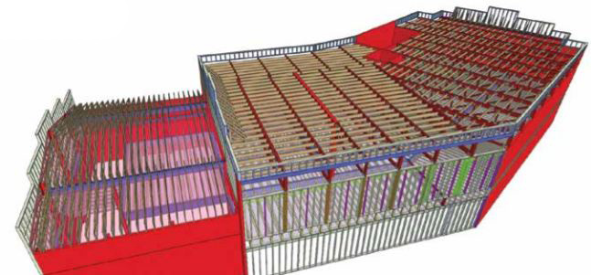
Since the GC solicited their work, Atlas Components had the opportunity to provide input into the design of the project from somewhat early on. “We worked in conjunction with them [the architect and engineer] to create the structure,” says Mike. “We helped them out,” he says, and used “wood trusses to solve some of the structural problems that they had.” Through a back and forth approval process, Atlas was able to provide the industrial look Vintage wanted along with a structurally sound roof and floor system. Their design suggestions helped provide a viable and less expensive option for the builder such that they did not need to “go and design the whole thing with heavy timbers. They could have done that,” says Mike.
Most of the visible parallel-chord roof trusses were four feet deep and needed to span 30-42 feet, typically at eight feet on center. These larger trusses were “four-ply flat trusses that had 2x10s running between them on the top,” says Mike. In an area over a balcony, however, the trusses were single ply and two feet on center, but display a somewhat unusual pitch. “The bottom and the top have the same pitch so they’re sort of like parallel chord, but they’re not 4x2, they’re 2x4, and that’s all visible,” says Mike.
While John had primary ownership of the project, Atlas has a policy of bringing all of their truss designers in on considerations that are “outside of the norm,” says Karl. “We have a dynamic in this office where we will talk to each other, and I think that’s really valuable,” he adds. “That makes everyone better overall.” Given the complex nature of the project, the designers had collaborative discussion on multiple design features.
One issue that required working through together was the fact that the ends of certain trusses needed to be made of FRT. Referring to the detail below, Karl says, “In the classic top chord bearing setup, the top chord goes through. Well this doesn’t. This is relying completely on the plate for the shear and the load transfer and all that, but it’s driven by the need to be all FRT.” He explains, “The plate was doing the work of a hanger almost.”
Another feature of special consideration was a sliding partition wall (at far left in illustration above). The wall features a partition “that’s suspended from the trusses,” Karl says, and can be pulled out to separate two dining areas or tucked away into a recessed space in the wall to create a larger open area. He adds that “the weight is borne by the roof” entirely as “it doesn’t roll on a track on the floor.” The wall required going through a variety of load cases to account for when it is both pulled out and tucked away. Karl says, “When it’s parked in its garage, so to speak,” the partition’s entire weight hangs under the last few feet of the truss, “and when it’s open, it’s more uniformly distributed,” requiring a design that “works in all conditions.”
Atlas appreciated the responses to their requests for information and design suggestions, as their level of detail and depth was more than what Atlas typically receives. Ultimately, the detailed communication among all the players on the Vintage project helped facilitate its success. Instead of seeing the more detailed feedback as simply more work to wade through, Karl always welcomes as much information as possible, seeing it as critical for helping him solve problems most efficiently.
Karl says the level of detailed design recommendations that Atlas is willing to offer, even about matters not directly related to their part of the project, is one way Atlas differentiates itself from competition. “I want a fruitful, long-term relationship with people,” says Karl, and offering design help, “bringing to bear anything that I can to make it better,” can only help Atlas in the long run as clients notice Atlas’s expertise and willingness to go the extra mile to ensure a successful project.
In addition to displaying the aesthetic potential of trusses, the project also highlights the value CMs can bring to the design process when involved early on, giving them an opportunity to find and offer solutions using their unique expertise.
Read on to learn more about the special considerations Atlas made in producing (digital edition page 27) and installing (digital edition page 28) these trusses.
Producing a Perfect-Looking Product
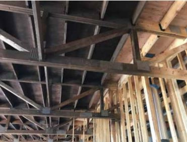 Knowing their work would be visible for the Vintage Brewing project, Mike says they “worked hard to make the trusses look pretty.” They took special care with the plates and lumber during production to prevent damage. “We saw this as an opportunity,” he says, as Atlas’s work could either “promote or hinder the industry as a whole.” Mike recounts that they wanted to create something that would cause onlookers to say “’Wow, that’s really cool. I didn’t know you could do that with trusses.’”
Atlas’s experience completing the job demonstrates that an aesthetically pleasing project such as the Vintage facility can include greater than usual work and resources that CMs should be sure to account for upfront. During production, the project required that Atlas reserve a special area in their shop for it. “It was such an ongoing thing that we created its own space,” says Mike. The project took approximately three weeks in production as opposed to the typical time of up to two days. One of the biggest expenses, however, were the fasteners used to assemble the multi-ply trusses. The plies were attached with three rows of WS3, WS45 and WS6 MiTek screws. Each row of fasteners were four inches on center. The number of screws, says Mike, meant they had to use what “would normally be a five-year supply of hardware for one job.” Since they would be visible, templates were made to ensure the screws were placed evenly. Atlas had an engineering student as a summer intern at the time who was assigned the task of screwing all the plies together.
In keeping with the 19th century, industrial aesthetic, as well as Vintage’s desire for a darker atmosphere, the trusses were stained after installation.
Smooth Installation Starts with Smart Planning
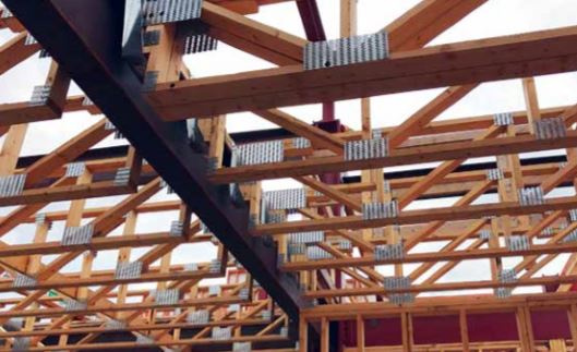 Atlas’s roof and floor trusses for the Vintage Brewing project were installed without any issues. Scott Truehl, Friede & Associates, says, “It went very well…the key there was the cooperation with all the players, understanding what the trusses were going to be like [and] how they were going to deliver them.”
The finished building is now a jewel in the crown of Sauk City, which has seen more development activity as a result. Scott says that the city is looking into “redevelopment of other projects because of this project.” In addition, the building has also been a contributing factor in road construction and utility improvements in the city.
Best of all, the Vintage Brewing project showcases the truss industry in a positive light and serves as a demonstration of the possibilities of truss design. It shows that, in the right circumstances, they can be both structural and aesthetic.

