Getting the Information You Need Just Got Easier!
Getting the Information You Need Just Got Easier!
One of SBCA’s top priorities is to organize and consolidate industry best practice information and disseminate it in a way that supports component manufacturers (CMs) in the marketplace, expands their market development opportunities, and helps them overcome any obstacles that popup. The best vehicle to share this information is the website, making it the go-to source for the industry to find the best information on manufactured structural framing, BIM, and related architectural/engineering technology.
“The new SBCA website provides an intuitive and information-rich user experience,” says Tom Brauch, director of marketing strategy and communications at MiTek.
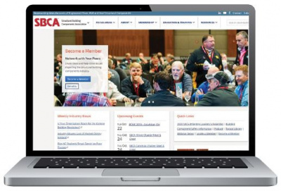
As the internet has advanced, it is important to re-evaluate how we present all of the industry-specific information SBCA has gathered and created and make it readily available online so that anyone can easily and effectively access valuable content and tools. Here are a few highlights from the redesign that developed out of the input from the CMs and suppliers who served on the Website Redesign Subcommittee.
The main obstacle in the redesign was compiling all of the tools and content into a more-organized and user-friendly navigation. Kyle May, a regional manager at G2 National, LLC, voiced an issue he had encountered on the old website that spurred new ideas for the redesign. “On the old site there were points where I would click into a page but then there were no options for getting back to the main page.” This feedback prompted a secondary navigation bar and breadcrumbs so visitors can link directly to other related pages quickly while also having a clear link back to previous pages within that section. For example, if a visitor hovered on the Membership dropdown and clicked “Member Benefits” to navigate to that page, they can then use the secondary navigation bar (under the main navigation) to link to any of the related Membership pages, or use the breadcrumb links to return to the main Membership page.
Kyle also shared his thoughts on the homepage and the necessity of highlighting the Industry News and Upcoming Events sections. “I feel it’s important to keep the news section on the main homepage,” says Kyle. “Instead of having the link for upcoming events, it would be nice to have a small schedule showing the upcoming events, whether it is an Open Quarterly Meeting or a weekly/monthly event taking place.” Both news and upcoming events are important to members and are now prominently displayed on the homepage.
Abby Yoder, a design technician at Stark Truss Company, Inc. also shared helpful feedback, providing a millennial perspective with the subcommittee. “For millennials, mobile access is a must,” Abby explains. “Appeal to younger generations by delivering content in a straightforward way, and use more pictures,” she adds. Abby also shares that “font styles and sizes for headers and content should be consistent.” With these recommendations in mind, we applied the same font styles and sizes and used a similar page layout for every page for a more consistent look throughout. We also focused on the site’s responsiveness for different screen sizes to roll out the best mobile and tablet experience with the redesign.

Tom’s recommendation led to the development of an electronic member application. “The application should be a web-based form so people can just fill them in online rather than using PDFs,” says Tom with regard to the old website. The new web form application was implemented with the redesign and has likely led to a better user-experience for the new members that have already filled out the online application.
Now that the website is launched, check out the new site design and user-friendly navigation. “I can get around on the site much easier – everything is a click away,” shares Tom. “The site navigation is easy to use and categorized well.” In Tom’s words it’s not just the navigation that makes it more user-friendly. “Besides the great information architecture, the site is visually pleasing and engaging,” says Tom, “Great job, SBCA!”
Thank you to the subcommittee for your feedback and suggestions. If you have any thoughts and ideas on the new website, please contact SBCA Staff.